In Course 4 we are learning about responsive design. Ethan Marcotte’s article “Responsive Web Design” does a great job of describing specific ways that code can create a responsive layout. He summed it up perfectly:
“Fluid grids, flexible images, and media queries are the three technical ingredients for responsive web design, but it also requires a different way of thinking. Rather than quarantining our content into disparate, device-specific experiences, we can use media queries to progressively enhance our work within different viewing contexts.”
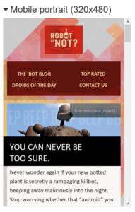
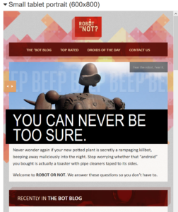
To explain this concept using Ethan’s eBook website, I compared two screen sizes and identified a few differences. I chose two portrait layouts: one a mobile size of 320×480 and the other a small tablet size of 600×800.
The experience of both is very interesting and artistic. The smaller mobile size condenses the menu links into a two item-two row menu whereas the larger small tablet view shows the menu items in a one-line view. From the smaller mobile view to the larger tablet view, the robot image rendered larger for aesthetic purposes. There is a reduced margin in the smaller view port to allow more content across the screen.
Mobile 320×480 View Port
Tablet 600×800 View Port
CSS code that allows these changes to happen include the following:
The heading and robot image are set to resize according to the screen size by using 100% of the container. This is accomplished as follows.
img {max-width: 100%;}
.nav-primary {width: 100%}
The margins reduce to allow more line content on smaller view ports through media queries.
@media screen and (max-width: 360px) {
.page { margin: 20px 10px;}
@media screen and (max-width: 768px) {
.page {margin: 20px;}
This comparison is a very small example of responsive design possibilities.
A successful result takes more than making sure content fits regardless the media size. Coding with artistic appeal regardless of media size is the result we should strive to achieve.
MODULE 4.3
In this module I created a fixed grid site to a responsive grid site using Bootstrap.