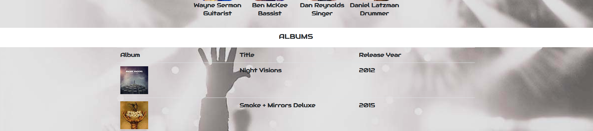
After learning more about usability and accessibility regarding website design, I updated my recent Discography project to make it a more accessible and user-friendly experience. I made eight changes to my site. Following are the changes and the story behind why I made them.
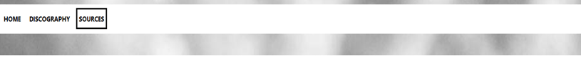
Two changes related to navigation: added background bar to the navigation panel as well as a hover element. My original design had the navigation centered without a background and without a hover element. This made it almost disappear on the page. The background bar makes the navigation elements more noticeable and more in flow with the page. The more obvious hover element allows the user to identify easily what they are clicking. In addition, I left aligned the navigation elements to allow easy access.
Navigation BeforeNavigation After
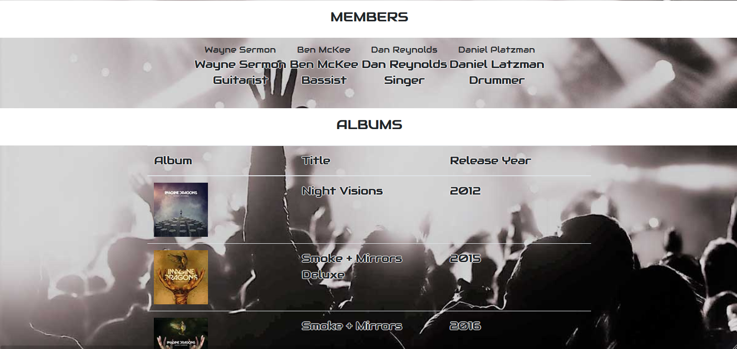
Third and fourth change included changing saturation of all background images and lightened table hover color. I reduced the saturation of each page by a minimum of 50%. Each page had a custom saturation decrease to ensure all pages were cohesive. This allows a greater contrast of text against background resulting in improved readability. Originally, the table hover color was dark, did not flow with the band-story background color, and did not stand out. With the Homepage Desaturated, it allows for better readability and flow.
Homepage OriginalHomepage De saturated
Fifth change removed white font shadow. Fonts had originally included a white shadow to allow readability when scrolled against the dark portions of the background. With the background saturation change, this shadow not needed. With the shadow removed, the font is much more user friendly.
Text ShadowText Shadow Removed
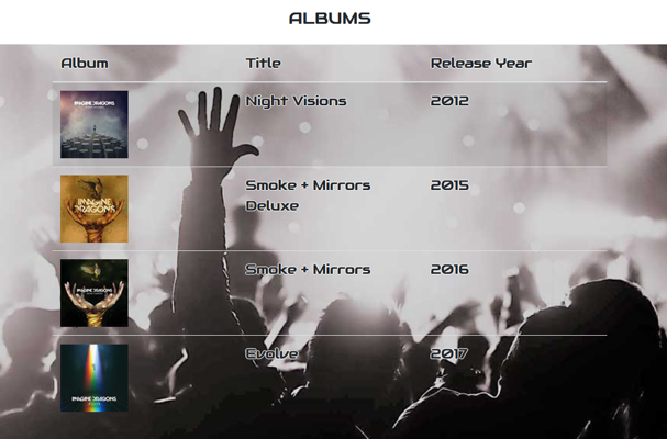
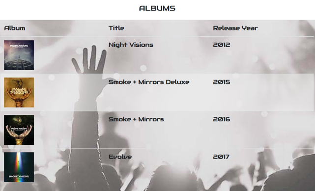
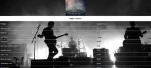
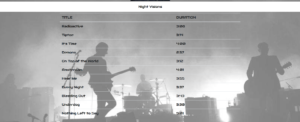
Sixth change narrowed the discography page tables. Original design was at 100% width. Reading from left to right included wide gaps between information. With this more narrow design, it allows the reader’s eye to follow the information more fluidly.
Full width tableNarrowed Width
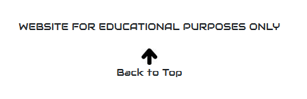
Seventh change added a “go to top” link. In the footer, I added a “go to top” link with an arrow image. This link brings the user back to the navigation pane. The pages are long enough that it took time to scroll up on my previous design. This addition makes the page more usable.
Without Go-To LinkWith Go-To Link
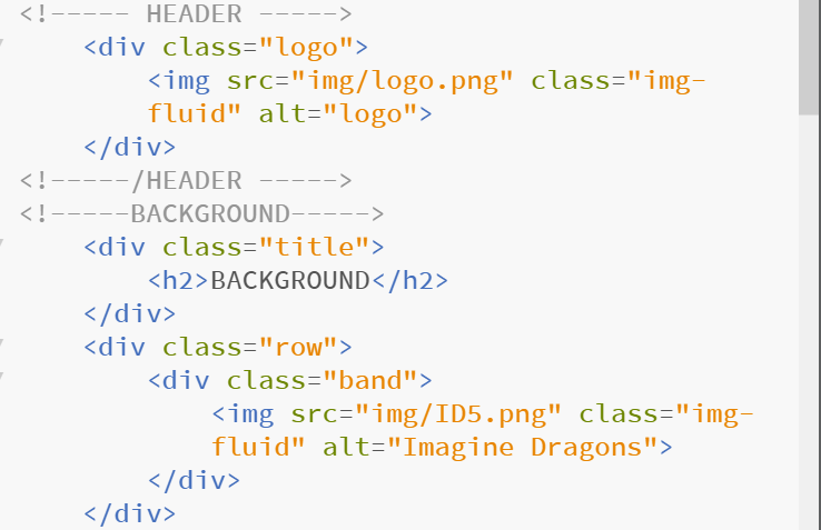
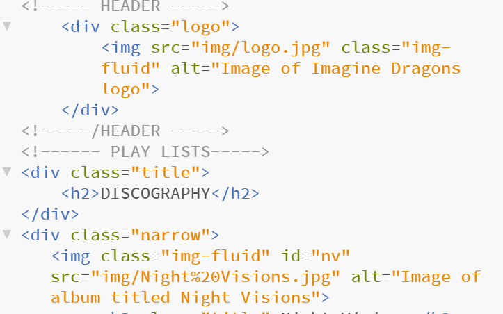
Eighth change reworded the “alt” tags. After learning about screen readers for the vision impaired, I reworded all “alt” tags to be more descriptive. This new description will provide a better graphic image to those needing a reader.
ALT Tags BeforeALT Tags After
Please take a look at my page: http://marywatkinsdesigns.com/ImagineDragons/index.html. I’d love to receive your feedback!
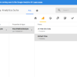
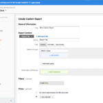
GOOGLE ANALYTICS ESSENTIALS
Through a Lynda.com course I was introduced to Google Analytics.
I am excited to have the power of this tool in my arsenal. It will be invaluable in identifying what to keep and what to update or remove. Following are screen shots of the 11 different sections of the course. Unfortunately there is no data for my site since the class was taken on the same date the account was set up.