If you were asked, “what objects are in a well-designed page?” You would probably identify the obvious: color, type and icons. However, there is one very important visual component that some overlook as an actual component: space.
I recently read “Space in Design Systems: From Basics to Expanded Concepts to Apply Space with Intent” by Nathan Curtis. In this article, Nathan proves this point by comparing the amount of of color, size, type, layout, and nine other properties use to the use of space. His results show that space and color are the two most used components used exponentially more than any other components and are very close in occurrence percentage.
What this boils down to is that the use of space is an integral piece of cohesive design and development and finding concepts to apply it correctly is beneficial. This is especially true when it comes down to teams working on a layout.
Consider the following to build a system where you can work with spatial density with greater intent and less risk.
Grids are not space; they are components that use space.
Baseline grids are some of the first thing to be determined. Look at grids as components even though they are empty at this. Make sure to take into consideration the overall end layout including margins, gutters and columns rather than seeing them as empty space. Determine a memorable base number to ground all other spatial values. This base number is a personal choice of the team but body text type is a good place to start. Some like a base of 10 that is easy to remember, base of 6 provides huge flexibility but that could also be a negative, base of 16 is a factor of all screen resolutions. The possibilities are endless so just make sure to choose a memorable base number but limit expectations on its use.
Identify scale and consider a styling process that gives you more control.
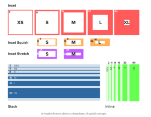
With an established base, scale is next. Scale is spacing values that are factors or multiples of the base number. These calculations can be a bit tricky: you can use an on-line modular-scale calculator. Some teams use a linear, fixed increment, scale to avoid unpredictable use: using random steps or knowing when to use a specific value. Since linear is not always perfect, consider nonlinear options like golden ratio, modular scale or geometric progression. Once your scale is identified, name these space options using a simple scale like S, XS, L, XL since this is easier to remember and apply than numbers. NOTE: most libraries like Bootstrap, Lightning, etc. do this. This can go a step further by identifying CSS rules for space (padding, margin, left, right, top and bottom) with inset, inset squish, inset stretch, stack, inline and grid. It may seem like a huge learning curve but with the help from a visual cheat sheet, if you give it a try you will find yourself embracing it.
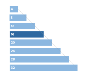
Linear Progression Example
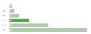
Non-Linear Geometric Progression Example
Cheat Sheet Example
My thoughts
During the chat, before I wrote this blog, I held the same thoughts the majority of the others did: many confusing calculations. I believe we all consider this could be helpful in the future though too: especially in an environment where many are working on the same project. After reading this article and a couple others, I have concluded that is true. I did struggle at first with the references to calculations but after reading some complimentary articles, I have a much clearer understanding and look forward to using these tips to work through my future projects.
This information does not solve all problems, there will be times spacing needs to be generic; try to use this sparingly though. Do not give up on this method if you run into exceptions: instead, try solving them systematically to be able to continue with this simpler, more productive, spatial system.I hope that this blog will get you thinking about new ways to look at design to allow more fluid layout steps.