
Studying other sites that you like can be beneficial.
Ideas are sometimes hard to come up so do not hesitate to look to successful pages for inspiration. There are more inspirational sites available to look at that any one person can ever study. Finding a location that provides several page examples makes idea gathering easier. One such site is Awwwards.com. This website shows best web design trends by posting the best developer, designer and web agency pages from around the world. Expect to gain a multitude of ideas here.
I used this site to gather information regarding the increasingly popular “flat design”, to gather design inspiration for a personal chef’s page, and to find and compare three inspirational “tag” examples. My results follow.
Flat design has become very popular due to its simplistic elements.
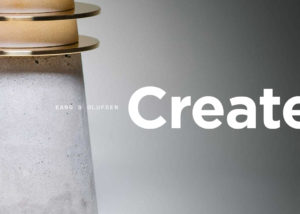
Looking at the examples of this design on Awwards.com, it is noticeable the non-use of 3D effects and ornate typography makes this a clean, simple, appealing design option. When used effectively the simple shapes of graphics and typography makes this an uncluttered, easy to follow option. I can envision this design option for logos as well as sites for social groups, environmental sites, and service sites among others.
No matter how popular a design option may be, it does not mean it will work for every project or be the right choice for every person.
For example, I used Awwards.com to find inspiration for a fictitious web design job for a personal chef. The example pages I chose for this scenario were not tagged as flat design: they were tagged as bright, clean, and minimal. The reason is that food is visual as much as it is tasteful so I feel the design needs to be very visual. The example pages also had a common thread of rectangular shapes and clean design.
For the front page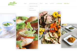 , bright tagged design inspired me. The elements I found useful for a personal chef page are the irregular overlapping boxes that would work great for showcasing delicious and beautifully bright specialty items against a light background. Dependent on the number of items, these boxes would work well as a slider.
I found a colorful tagged example for the menu page. The takeaway from this page is the continued rectangular shapes and the two page design. Here I envision keeping a two page rectangular shape used as a swipe album of food items with detailed content.
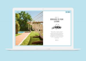
 Of course everyone wants to know who the personal chef is so an about page is required. For this page I chose a minimal tagged site. I like the consistent clean look with rectangular box design. Here I can see a photograph of the chef in one box and clear yet minimal description of what he/she is about.
Although all three pages were tagged differently and the choice of page examples was random, it was not surprising to find two pages held the same three tags. Consistency makes a site!
Page choice should be determined by site purpose but designer preference also plays a part.
Three tagged page groups from Awwwards.com that I gravitate towards are: Graphic Design, Photography, and Big Background Images. These page examples are appealing to me because they tend to be artistic and full page design. Front page design would make a huge impact and could stand alone. I see the combination of these type pages being useful for artists, events, vacation sites and other sites where substantial graphics would make an impression.
With so many examples of great sites to reference, you can fun with website design even if you do not consider yourself creative. Take a look around, learn from examples, and build some great sites! Your site may be the next one someone checks out for inspiration!